New User Guide, better onboarding and more in Timelines 1.8
With this update, I have focused on refining the overall experience, and the initial experience in particular. The main goal was to make it easier for new users to get a solid understanding of how Timelines works and how to best utilize it.
I'm happy to announce that after a fair amount of work, Timelines 1.8 is now done and available for download on the App Store!
If you aren't a Timelines user yet, this update is especially for you - I have invested a lot of time into improving the initial onboarding experience. Tips on how to use certain features (such as how to use event names as subcategories, or how to add events that happened in the past) are displayed at just the right time when you need them. This allowed me to make the initial setup much more frictionless than before.
All the other improvements are meant for both newcomers and long-time users of Timelines:
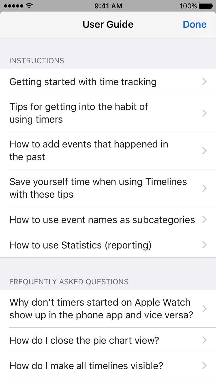
User Guide
Get tips on getting started with time tracking in Timelines, as well as brief explanations of the most important features.
While Timelines has been shipped without instructions for the past year and a half and most users didn't have a problem with getting acquainted with it, some people have struggled. Especially those who have never used a time tracking app before. That's why I decided to write a series of articles which explain both the basic concepts, the advanced features and also give some time-saving tips. Images and short videos are used for better understanding.


I definitely plan to eventually make this Guide available online as well, and will link it here once I do.
Refining overall user experience
This update also has all-round improvements, such as:
Easier access to Event names breakdown
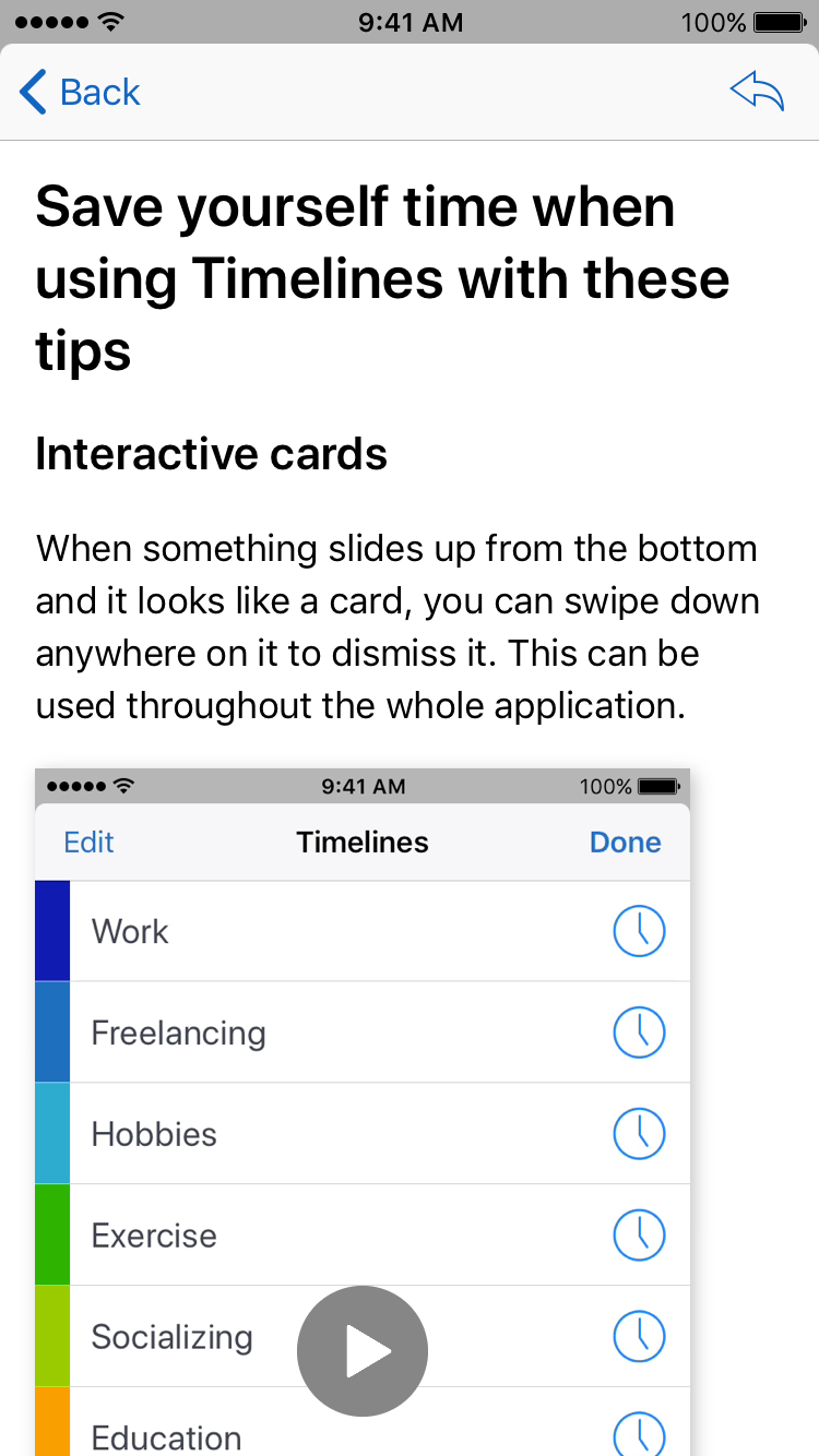
As opposed to having to tap on a small disclosure button, you can now get to the breakdown just by swiping anywhere on the pie chart screen when a slice is selected. Here's what it looks like:
Other improvements
- New confirmation sheet when deleting a timeline which does a better job of emphasizing that the action is permanent.
- Revamped visible timelines picker, so it's easier to mark all timelines to make them all visible.
- New way of moving time blocks from one category to another.
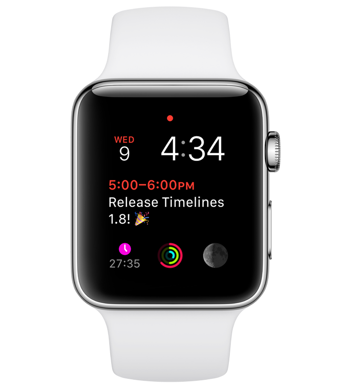
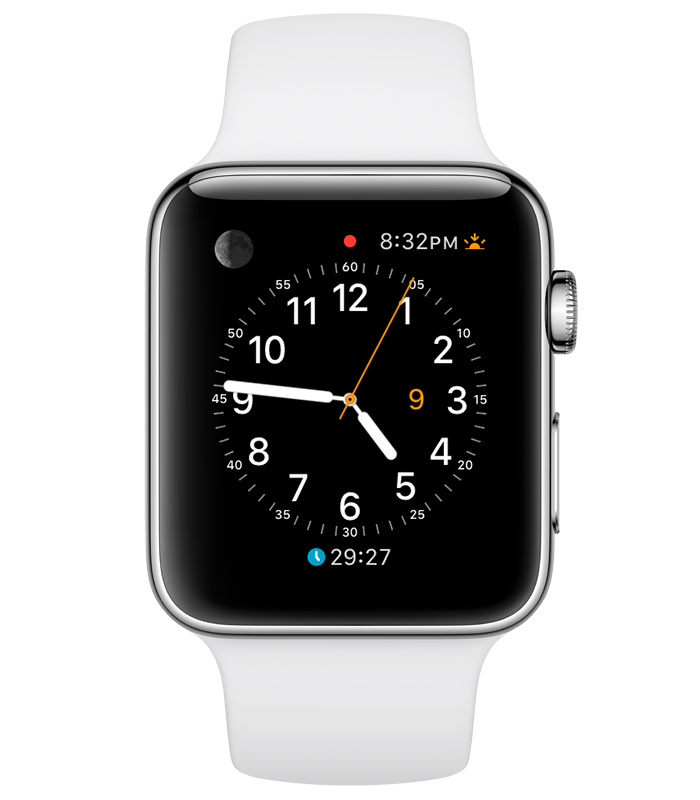
Colorful watch face complications
On multicolor watch faces, you will now see the color of the actively tracked timeline (category) along with the tracked time. This makes it much easier to see at a glance whether the active timer is the correct one, or if you need to switch it. Here is a few examples of what it looks like:


As always, I hope this update will be useful to you, whether you're already using Timelines or perhaps considering getting it.
The next step will be a major update - new 2.0 version. I don't want to pre-announce it too much, but rest assured - there's a lot of exciting things to look forward to!
(Update: Timelines was recommended in this blog post! Top 6 Business Solutions To Enhance Efficiency And Productivity thanks to sense.hr).
